Adding analytics to Prezly: Behind the feature
10 min read - Analytics was always on the top of Prezly feature request. We've decided to join forces with one of the best analytics tool out there to make it happen.

Analytics is an essential tool for understanding the performance of your communications. As a platform that helps users manage their communications, it's no surprise that it was such a highly requested feature for Prezly.
Until now, many of our users relied on integrating Google Analytics into their sites to track the performance of their content, but what they really wanted was a solution that was integrated into their Prezly workflow.
This is the behind-the-scenes story of how we joined forces with Plausible analytics to make it happen.
Why working on this?
One of the challenges of using Google Analytics (GA) is that it requires users to leave their Prezly accounts to track the performance of their sites. This can be disruptive to their workflow and may not always be the best fit for their needs, as GA can be complex and have a steep learning curve.
In addition, there have been increasing concerns about the use of GA, particularly in Europe where data protection laws are stricter (such as the General Data Protection Regulation, or GDPR). Italy has already banned the use of GA, and it is expected that other European countries may follow suit. This highlights the importance of having an analytics solution that is seamlessly integrated into your Prezly workflow and compliant with data protection laws.
.jpg)
Given the time and resource constraints, we knew that we couldn't build an entire analytics suite from scratch. However, we wanted to provide our users with a powerful and privacy-conscious analytics solution that could help them track the performance of their content. That's when we decided to integrate Plausible Analytics into Prezly.
Not only is Plausible a highly effective analytics tool, but it also aligns with our values around privacy. As an open-source software, Plausible prioritizes privacy in web analytics. It uses a lightweight script (45 times smaller than GA) to track only the essential metrics, and all site measurements are carried out anonymously. No personal data is collected or stored, and Plausible Analytics does not use cookies, making it a GDPR-compliant choice for our users in Europe and beyond.
How did we solve it?
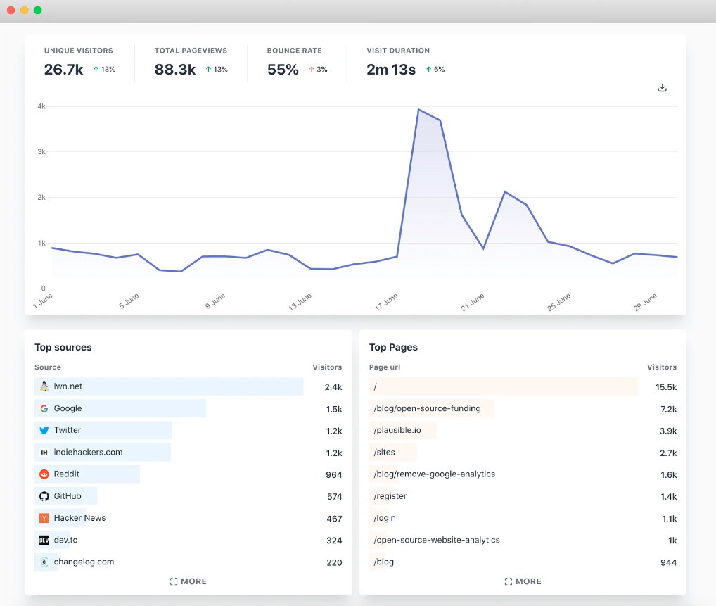
Our goal with integrating Plausible into Prezly was to provide our users with essential traffic reports for their sites and individual stories, all in a privacy-first manner. To achieve this, we created a "Plausible project" for each site and used their script to track data usage. We also utilized Plausible's dashboard embed feature to display the data in an easy-to-understand format inside our app.
Initially, we considered creating our own interface (UI) to showcase the data, but we quickly realized that it would take longer than the two weeks we had allocated for the project. Fortunately, Plausible's dashboard has a well-designed UI that blends seamlessly with our own (they even use the same font), so we decided to use it instead.
.png)
While using Plausible's dashboard solved the UI issue, we still needed to ensure that the integration was logical and user-friendly. This was not as straightforward as it seemed, but with careful planning and collaboration, we were able to successfully integrate Plausible Analytics into Prezly.
Where will analytics live?
At first, it seemed like a straightforward question: where should we put the analytics dashboard in Prezly? However, as we considered our options, we realized that finding the perfect location was a bit more complicated.
Our first thought was to add the dashboard to the site settings page, but we quickly realized that this might not be the best fit, as analytics and settings are two distinct concepts. We then considered creating a specific page for analytics, but that presented its own challenges. We had to consider where this page would live and how it would connect to the rest of the app.
As we debated these options, we returned to our original idea and realized that the "settings" page was actually a bit of a misnomer. While it did contain a number of sub-pages with settings, the page itself had no title and wasn't explicitly labeled as a "settings" page.
At this point, we realized that users were already accustomed to seeing all their site-related stuff on this page, and with all the "settings" thing out of the equation, it made sense that they would also go there to see how their sites were performing. So, we decided to add the analytics dashboard there, giving it a special place at the top of the list of sub-pages.
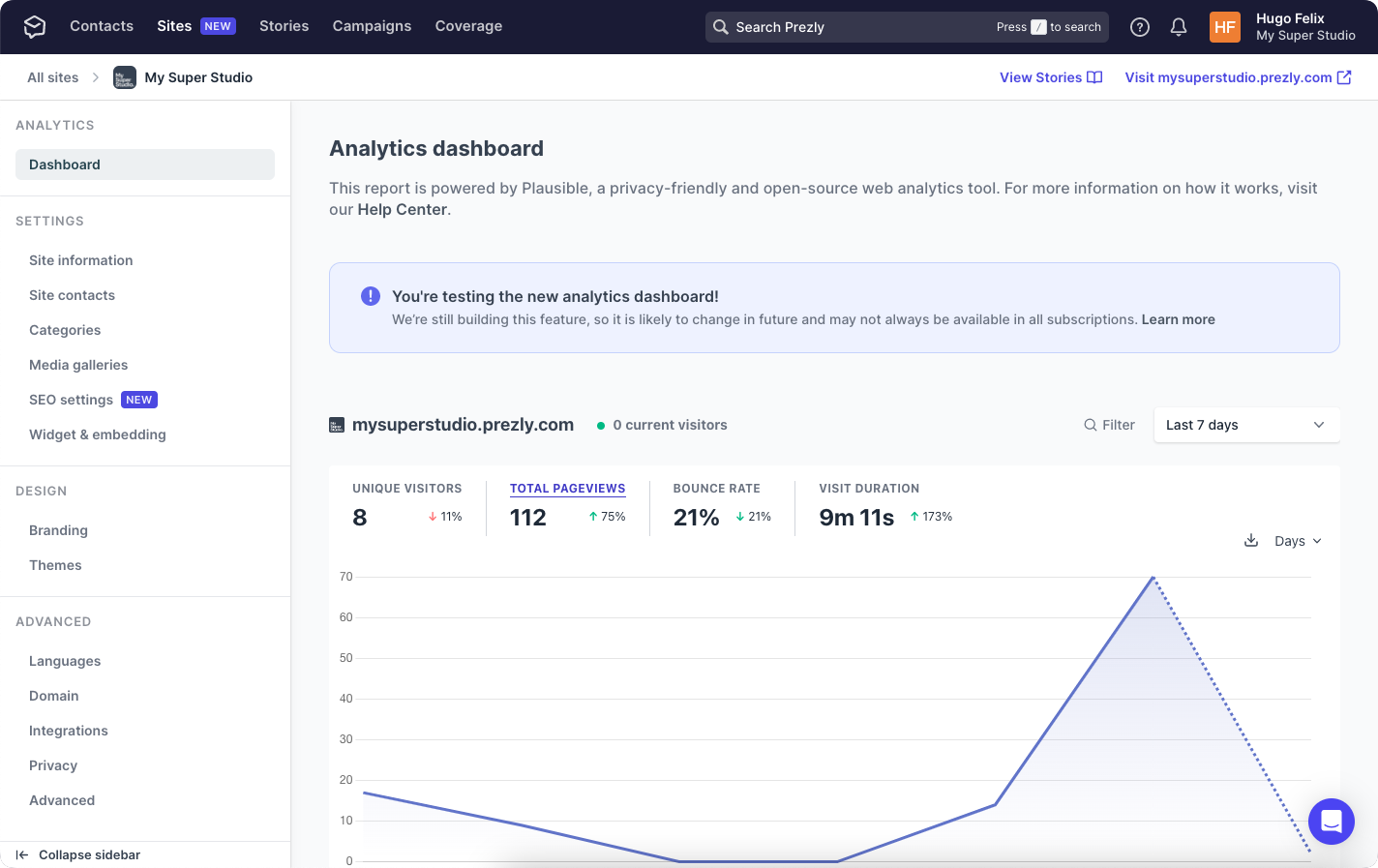
For now, this seems like the best solution, but we will continue to assess and fine-tune the placement of the analytics dashboard as needed.
How do we link users to it?
The second challenge we faced was how to get users to the analytics dashboard. We needed to identify the best places to include links to the dashboard and find ways to increase its visibility.
We considered a number of logical options:
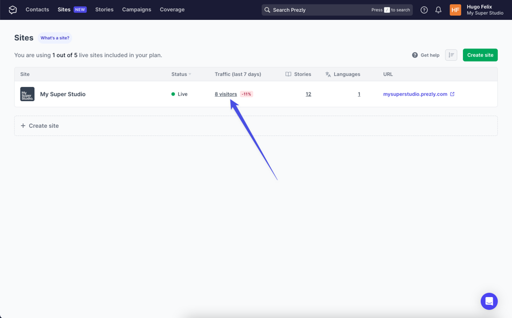
- Sites grid: We knew that 21% of people who reach the site's "settings" page come from the site grid. This suggested that users often go there to learn more about or change something about their sites.
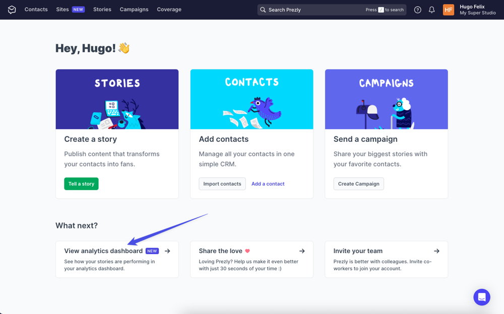
- Welcome page: As a way to introduce new users to this feature, we also included a link to the site analytics on the welcome page, which is the first page users see when they login to Prezly.
- Story editor (after publishing): This was a stretch goal, but we managed to make it happen. We always wanted this project to be the beginning of having in-depth analytics within Prezly, and we realized that linking analytics to individual stories was a logical next step. When we realized that we could filter a specific story in the analytics dashboard, we decided to add a link to it (with the story filtered) on the story editor page of published stories.
Overall, by considering the most logical places to include links to the analytics dashboard, we were able to increase its visibility and make it easier for users to access and benefit from this.
Limits: Feature limitations
At present, we are making the analytics feature available to all users as we evaluate how it is being used. However, in the future, it is possible that this feature may only be available to users on higher tier plans, as it is a powerful tool that can serve as a strong selling point for upgrades. It is worth noting that there are other options, such as Google Analytics, that can be used as a workaround for tracking analytics, so users on lower-tier plans will still have some options available to them.
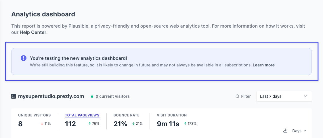
To make sure users are aware of the potential changes to the analytics feature, we have added an informational block at the top of the analytics page. This block explains that the feature is currently in beta and may undergo changes in the future, including being limited to higher-tier plans. By providing this information upfront, we hope to manage expectations and ensure that users are aware of any potential changes to the feature as we continue to assess and fine-tune it.
Promoting the feature
This was a major feature for everyone, including the team within the company, so it was important to promote it effectively. To ensure that the launch went smoothly, we worked closely with the marketing and customer success teams from the start. Together, we developed a plan that included the following steps:
- Update the help center documentation: The launch of the analytics feature touched many aspects of our documentation, so we needed to not only write a new doc about how to use the feature but also update a number of other docs where analytics were mentioned.
- Post a changelog article: We have been making an effort to improve our communication with customers, and the changelog has proven to be a valuable tool in this regard.
- Write a company news blog post: A major development like the launch of the analytics feature deserves a prominent mention and what better place to do this than on our company news blog, which appears prominently on every user's login screen.
- Reach out to users who requested the feature: These users were a driving force behind the development of the feature, so it made sense to let them know as soon as it was available.
- Announce the feature through the newsletter and in-app notifications: Our newsletter and in-app notifications are key channels for communication with our customers, so it was a no-brainer to announce the new feature through these channels.
- EXTRA - Write an Academy article featuring the Plausible co-founder: While the technical details of the feature are important, we also wanted to give users some insight into the broader industry and why we decided to integrate Plausible analytics. Who better to do this than the analytics specialist behind our new dashboard?
Measuring success
This project is not yet complete. As with any project, there are always ongoing improvements and adjustments that can be made.
Currently, the analytics feature is still being tested. We want to understand how useful it is for our users and how it fits into their daily workflow. It's also important for us to understand the cost of this feature (we need to pay Plausible for it) and whether it should be included in all plans or only offered as an add-on for higher-tier plans. There is still much to be learned, so we will continue to closely monitor the feature and make any necessary adjustments.
What have I learned from this project?
- You can track analytics without compromising on privacy.
- Many people assume that sacrificing privacy is the price to pay for good reporting, but companies like Plausible are proving that this doesn't have to be the case.
- Check out the Shape Up framework for this project.
- This was our first time using this project management method, and it has helped us stay organized and on track. If you're not familiar with Shape Up, we recommend checking it out.
- Don't loose time creating something you don't know you need
- In the early stages of testing, we didn't need to create our own interface for the dashboard. Instead, we used the embed function of Plausible, which worked well and saved us time. In the future, once we have a better understanding of user needs, we may consider designing our own interface.
See you in the next project! 👋
Hugo Felix
Product Designer @Prezly | → hugo@prezly.com
