Case Study: The Story Behind Prezly's Billing, Plans, and Self-Upgrades
This is the story behind the design and development process that brought Prezly users the ability to overview and self-upgrade their subscriptions.

Previously, Prezly users were required to contact support to upgrade their plans, causing inconvenience and delays. The ability to seamlessly self-upgrade and purchase new plans within the app had long been a desired feature among our user base (and Prezly stakeholders). Finally, we were able to make this a reality, and in this article, we'll take you on the journey of how we accomplished it. From ideation to implementation, we'll provide a comprehensive breakdown of the solution we developed to bring this highly sought-after feature to life.
Why working on this?
As Prezly's pricing model evolved, the accumulation of exceptions and complexities made it challenging to consolidate and simplify our range of products and prices. This lack of clarity and explanation about plans within the app occasionally restricted users from accessing new features without clear reasons.
Moreover, the app's inconsistent enforcement of plan limits allowed users to continue using outdated or deprecated plans without incentives to upgrade, resulting in missed opportunities for Prezly to increase revenue and for users to take advantage of new features.
Introducing new plans was also problematic due to difficulties in adding them to our marketing pricing tables, such as with our carefully designed pricing model for PR agencies, which was not effectively promoted on our marketing website.
In addition, there was no plan promotion within the app, forcing users to leave and visit our marketing website to check pricing options and features.
Furthermore, the only way for users to upgrade their plans was by contacting our support team, causing user frustration and creating an unnecessary burden on our customer support resources.
How did we solve it?
Before implementing any additional pages, options, or features to the app or marketing website, we recognized the importance of fully understanding our pricing model and users' plan details. To achieve this, we conducted an inventory to identify areas that required attention and prioritization.
Our research revealed that more than 30% of our user base was on outdated plans that were no longer supported or intended to be supported.

From this understanding, we concluded that our first step towards a comprehensive solution was to enable users to easily identify their current plan, its limitations, and start enforcing some of the plan's limits.
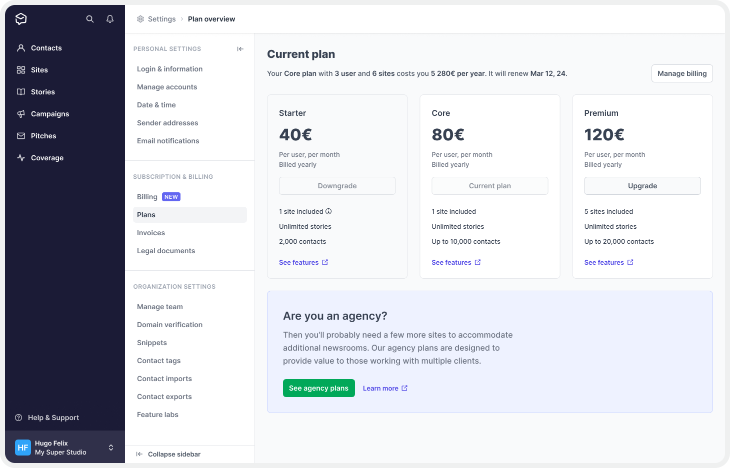
After enabling users to identify their current plan and its limits, we recognized the need to display all available active plans to facilitate easy comparison. To achieve this, we created a table that included each plan, its limits, and features for efficient decision-making.
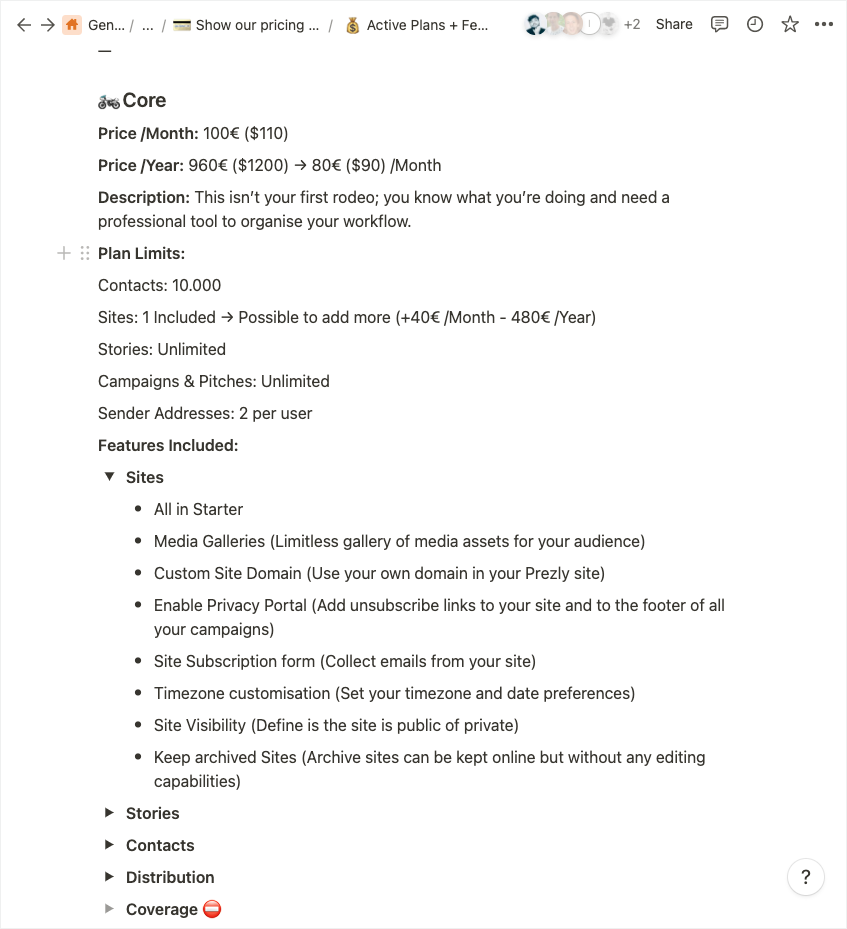
While working on the table, we recognized the need for a centralized location that would house all plan information, such as pricing, limits, and features. We referred to this location as the "source of truth," where we could make changes that would reflect throughout the Prezly universe, from the app to the marketing website.
Although this was a backend-heavy task, it was essential not only for this project but for future projects related to plans and pricing. By creating a centralized location, we laid the foundation for a more streamlined and efficient process for any future plan or pricing updates.
Our next objective was to enable users to upgrade their accounts within the app. After exploring several options, we decided to modify our existing activation wizard to also function as an upgrade tool. By implementing these changes, we were able to improve two parts of the app simultaneously, benefiting both the activation and upgrade processes.
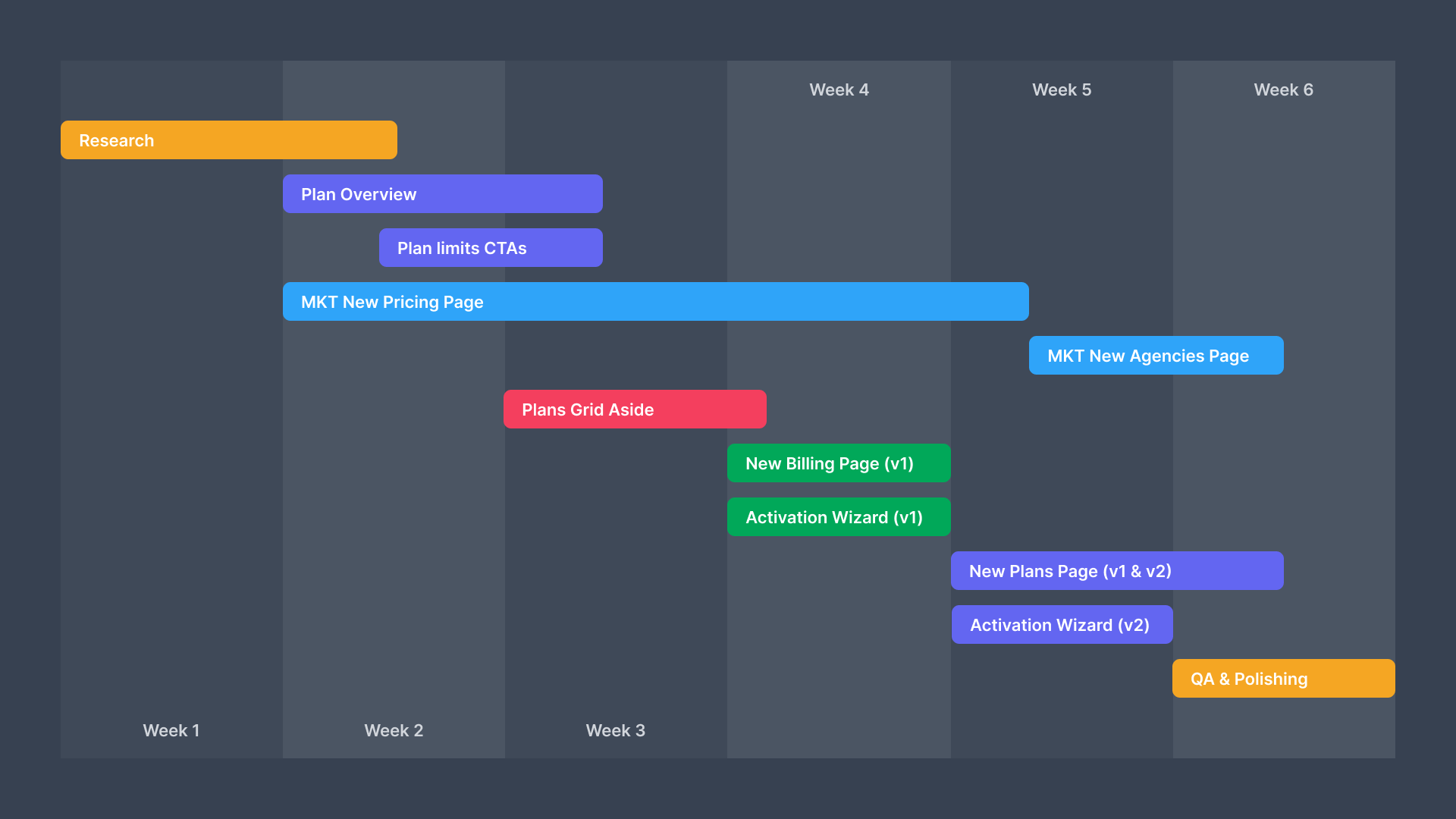
Plan Overview and Limits
To begin, let's take a closer look at how we implemented a new feature on our Settings page. Our goal was to streamline the billing experience for our users by creating a new Billing page that would consolidate all billing-related information in one place. The new page included the following components:
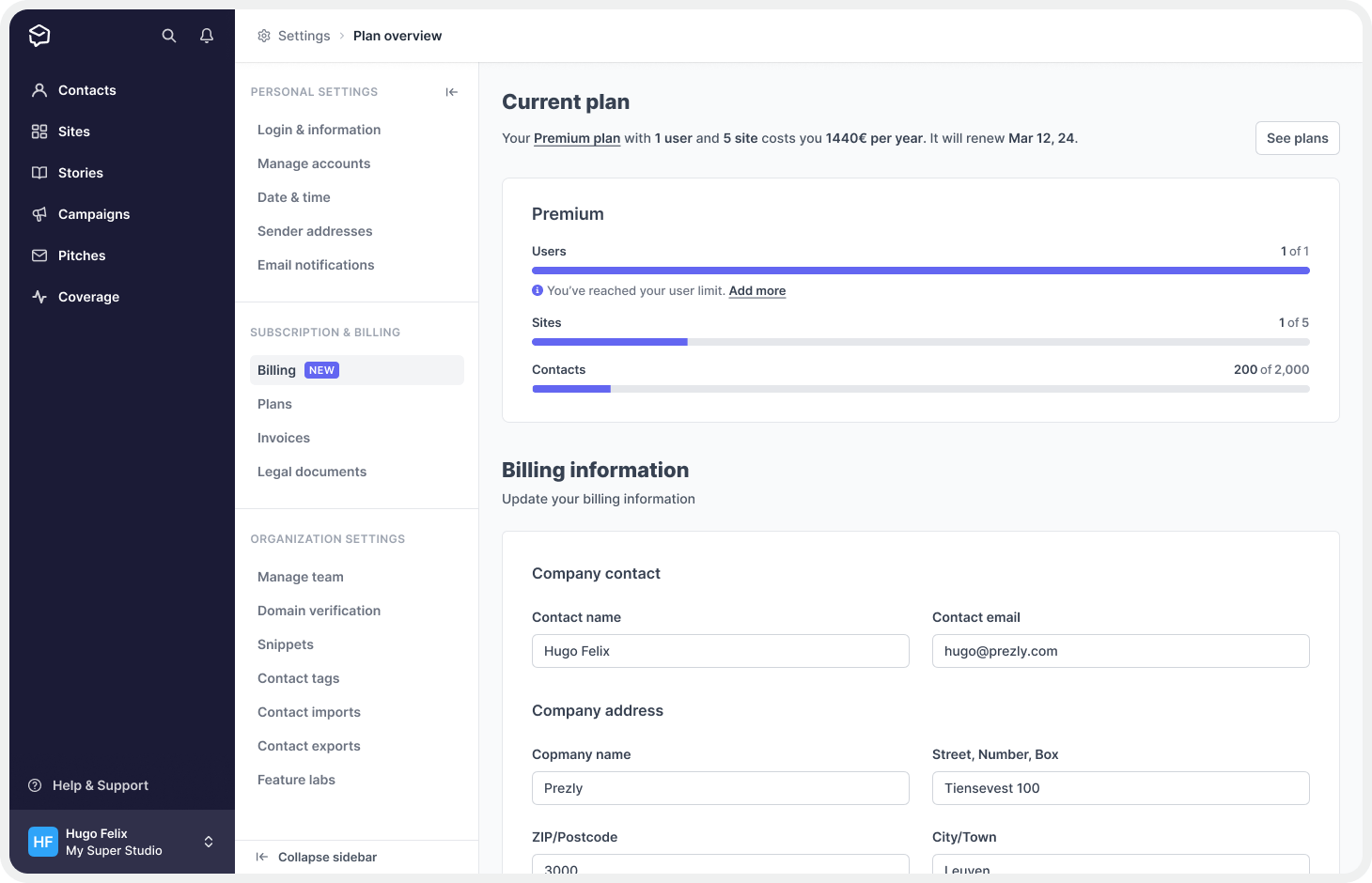
Current plan section
The Current Plan section was designed to provide users with greater insight into their subscriptions. This included details such as their current plan, the associated cost, plan limits, and the user's usage of those limits. By incorporating this information, we aimed to give users a comprehensive overview of their current plan and its limitations.
.png)
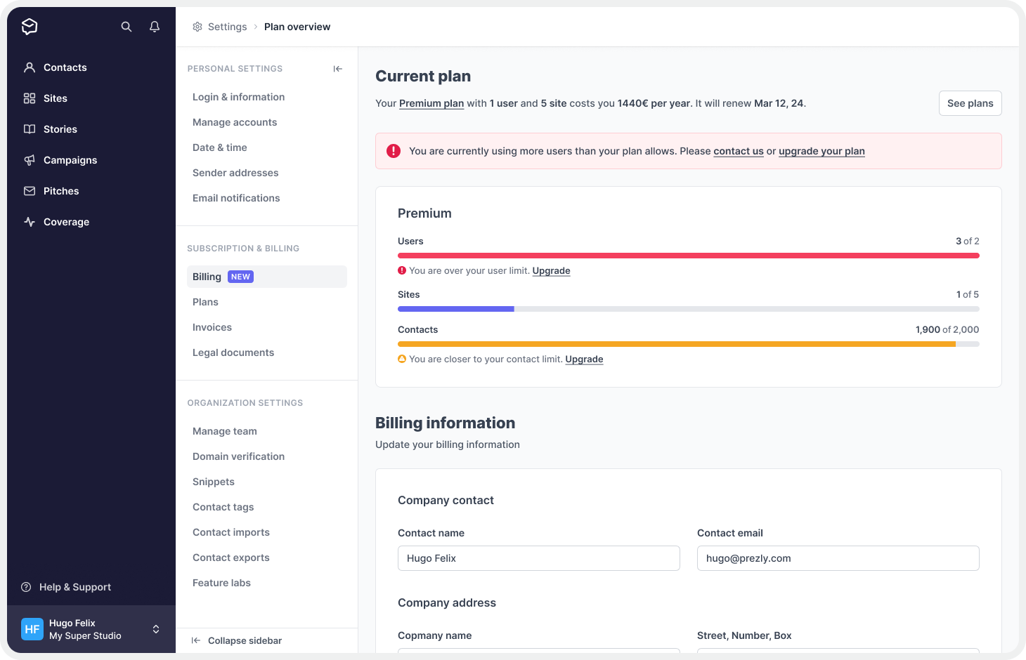
To make the limits and usage more visible, we opted to display them in the form of a progress bar. When the limits are close to being reached, the progress bar changes color and a warning message appears, alerting users to the situation. This message also includes an actionable solution to help users address the issue before it becomes a problem. We aimed to make it easy for users to monitor their usage and avoid unexpected charges or other issues related to exceeding plan limits.
.png)
We also designed this section with adaptability in mind, allowing us to reuse it in the future on other pages. For example, I envision incorporating it into a main dashboard or homepage for the app. By creating a versatile design that can be easily repurposed, we aimed to save time and effort in the development of future features and pages.
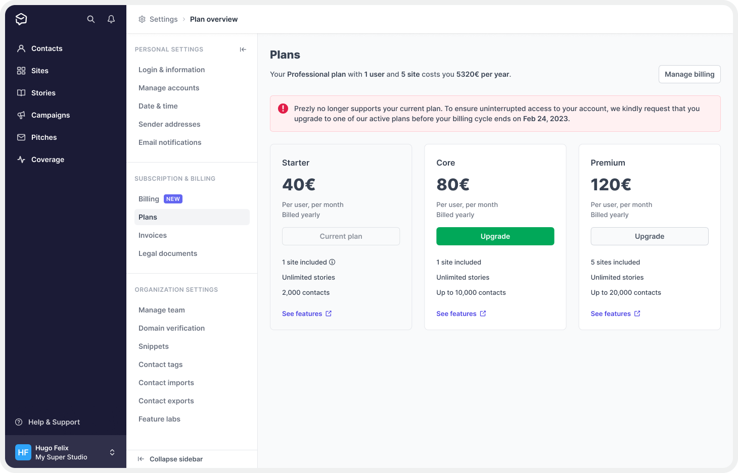
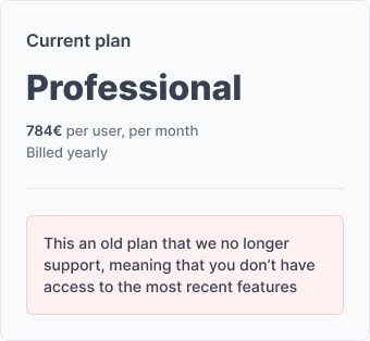
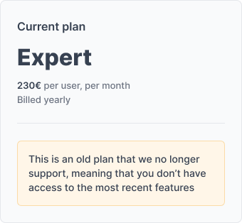
In addition to the above, it was also crucial to clearly inform users if they were on an old, legacy, or deprecated plan. To achieve this, we decided to withhold plan limit information and instead show an alert box that explains their plan situation and offers the option to upgrade. This approach ensured that users were aware of their plan's status and could take action to upgrade if necessary, while also avoiding any confusion or frustration related to outdated plan limits.
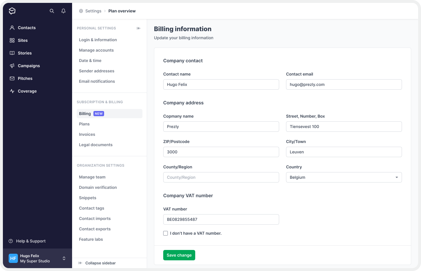
Billing information
Previously, the billing information was located on a separate page. To ensure consistency across the app, we decided to incorporate this component into the new Billing page.
.png)
Payment details
Another feature that was part of the old Billing information page was the payment details section. This section allowed users to change their default payment method and add a new credit card, as well as the ability to cancel their subscriptions.
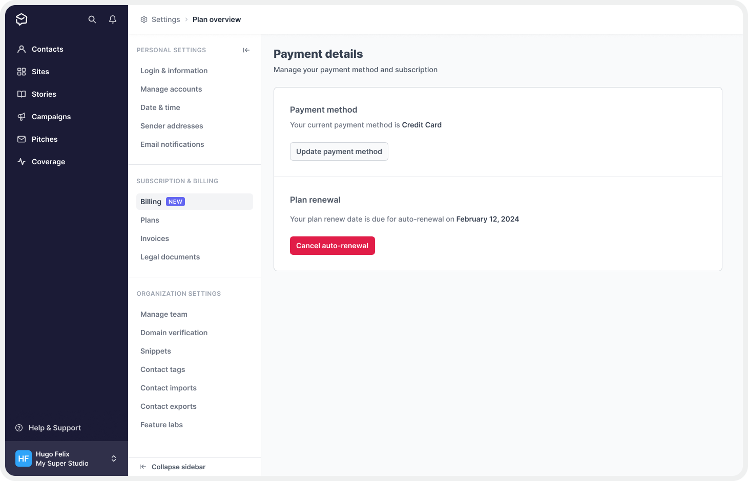.png)
Showcasing Plans
After informing users about their plan details, we needed to provide them with alternative plans to upgrade to. We created plan cards based on the new plans tables (pricing, limits, and features) - the source of truth - and our work on the marketing website. This allowed users to select the best option for upgrading.
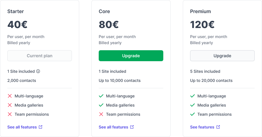
The purpose of these cards was to provide users with important information about the available plan options, including the plan name, cost, and limits (which we found to be the main reason for upgrades), as well as a list of the most significant feature differences between them (another crucial factor in the decision-making process for upgrading).
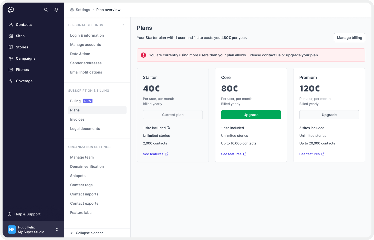
We implemented the primary action (green button) to be displayed in the plan above the user's current one. This way, the interface intelligently identifies the user's current plan and attributes the plan above it with the primary action of the page.
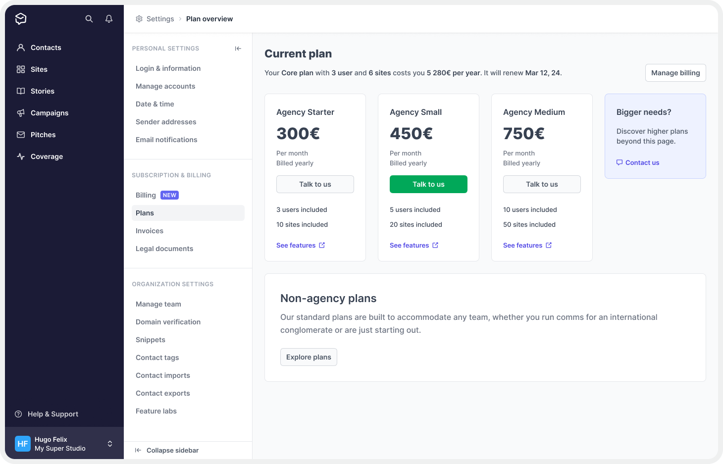
We also aimed to add a call-to-action (CTA) for the newly introduced Agency plans, which are designed for users requiring higher limits on users and sites. These plans offer all the features included in the standard Premium plan but come with predefined numbers of users and sites, making them a compelling choice for customers with more demanding needs.
To determine which customers would benefit from the agency CTA, we developed a system to identify potentially interested users.
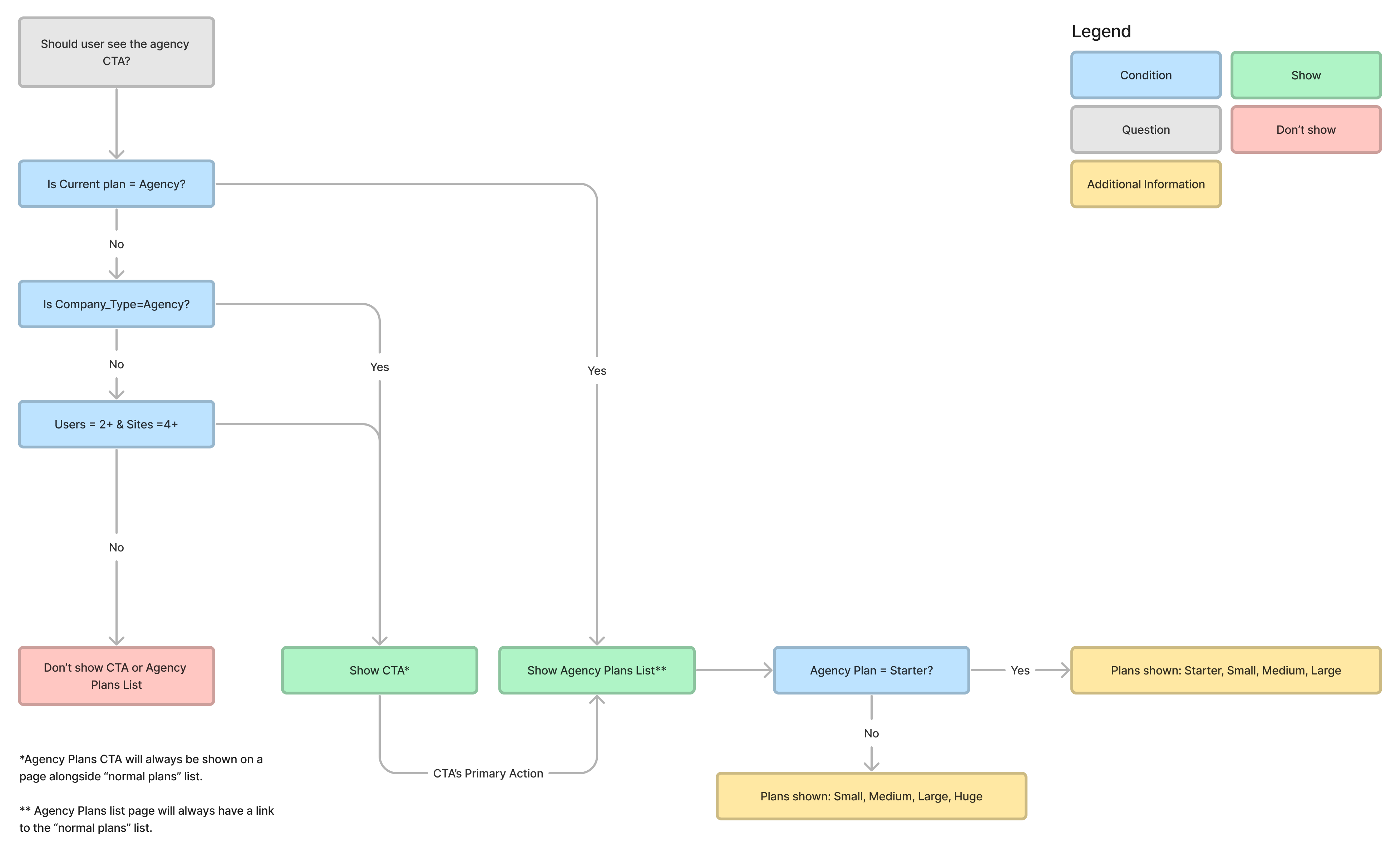
We defined customers with 2+ sites and 4+ sites, ensuring that the agency CTA would only appear for those who could benefit from it, keeping the interface clean for everyone else.
Those customers that were viewing the agency CTA would have the ability to navigate to a version of the page where they could see the agency plans in more detail, with cards similar to the ones presented on the standard plans page.
We even made the primary action identification (where the green button goes) smart enough to understand when it's better to display it on the agency CTA rather than in the plan cards. This ensures a smooth user experience and helps to direct customers to the best plan for their needs.
Once users are on the agency plans page, they can easily navigate back to the standard plans by clicking on a button located at the bottom of the page.
We have chosen to limit upgrades to agency plans to sales contact only since they are new plans and may require additional information about their key differences to be better explained. Nothing beats a good old chat to make things clear, right?
To ensure that users who are over their limits or are using legacy/deprecated plans are aware of the urgency of upgrading, we have added an alert box at the top of the page. This will help to draw their attention to the need for an upgrade and encourage them to take action.
The new plans page provided our users with clear and detailed information about available plans, pricing, features, and limits, allowing them to easily upgrade to the plan that best fit their needs, and the inclusion of an agency CTA targeted to users with higher needs, along with the smart primary action identification, ensured that users were presented with the most relevant upgrade option.
Now that this was out of the way was time to start working on the self-upgrade flow itself.
Self-Upgrade Flow
The self-upgrade flow was based on an existing feature we already had in Prelzy — the Activation Flow.
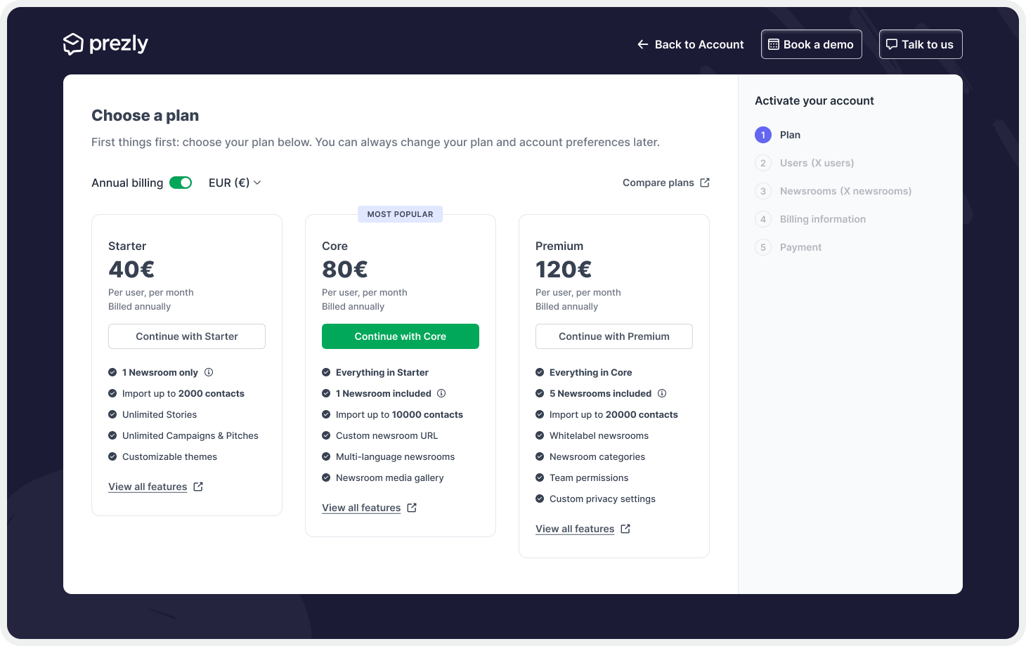
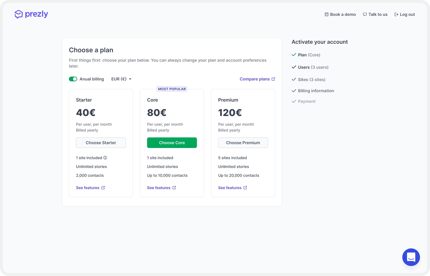
We started our work on it by bringing the activation flow up to date with our current design standards. Previously it included a dark background and a layout featuring numbered steps of a wizard. This old layout was constraining us to create new or different steps without making it harder for users to understand.
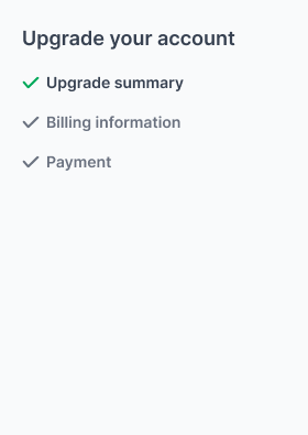
The first thing we did was to make it light, by introducing the same color scheme we use for the sign-up flow. Additionally, we removed the step counter and replaced it with a checkmark system that better tells users where they are at, what has been done, and what they still need to do. By introducing a color system to those checkmarks, we've also improved the visual indication of each "step" state.
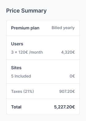
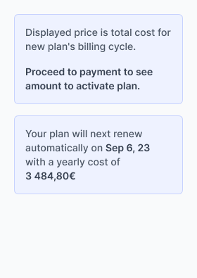
Additionally, we've also introduced some changes to the pricing overview, to include more details about the plan's pricing, such as the extra sites, VAT amount, and additional information about how the payment would be processed
With the activation wizard improved, we moved on to create a new "step" which we called the upgrade summary. In this step, we wanted to give users information about their current plan as well as the differences between the plan they were about to upgrade to.
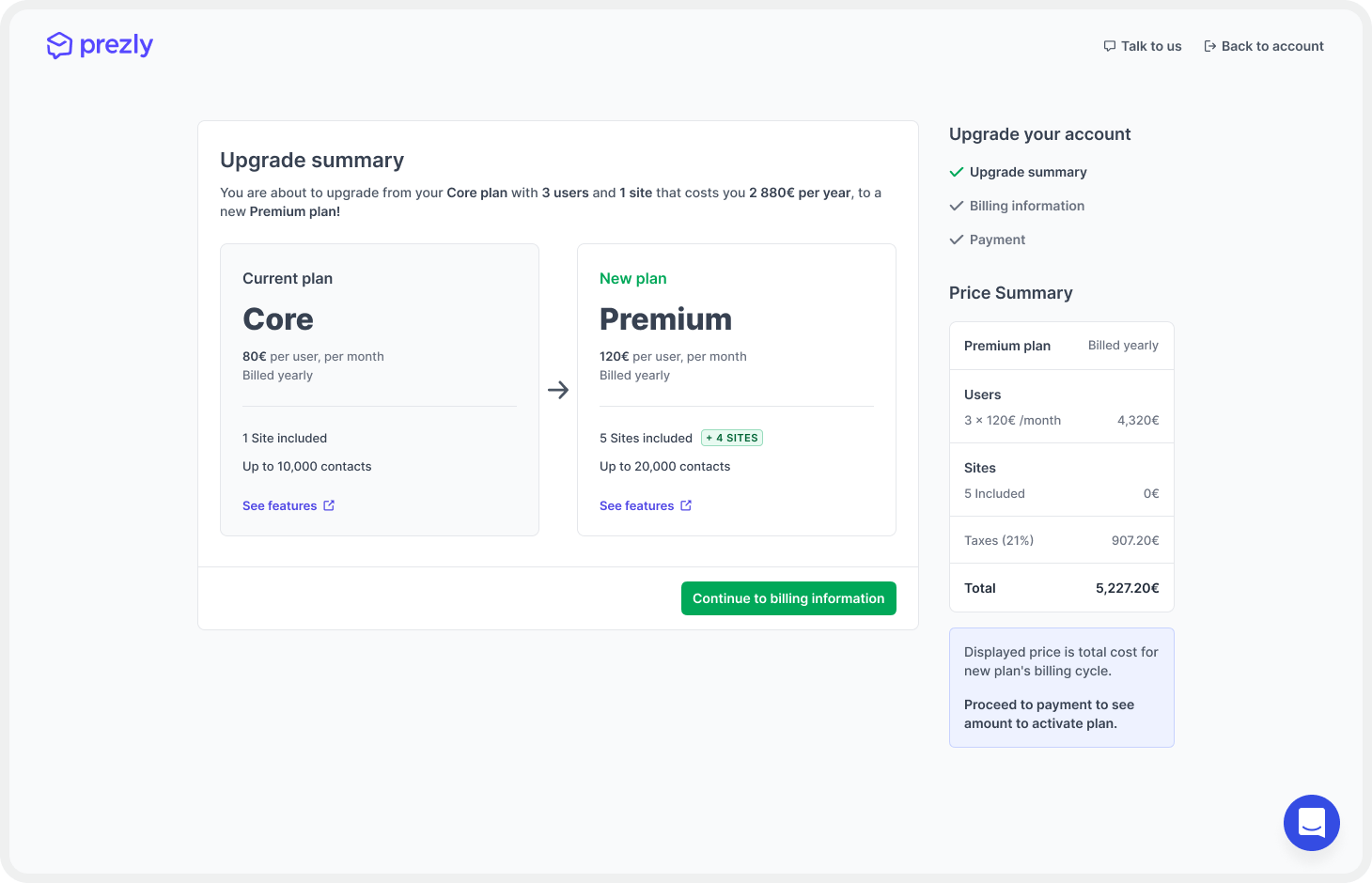
Another thing we added to the upgrade summary was alerts for deprecated/legacy plans inside its "current plan" cards.
The main goal for the rest of the flow was always to keep this it as simple and as straightforward as we could, so we decided (at least for now) to not allow users a possibility to change their users or site amount, leaving only the billing information and the payment steps visible.
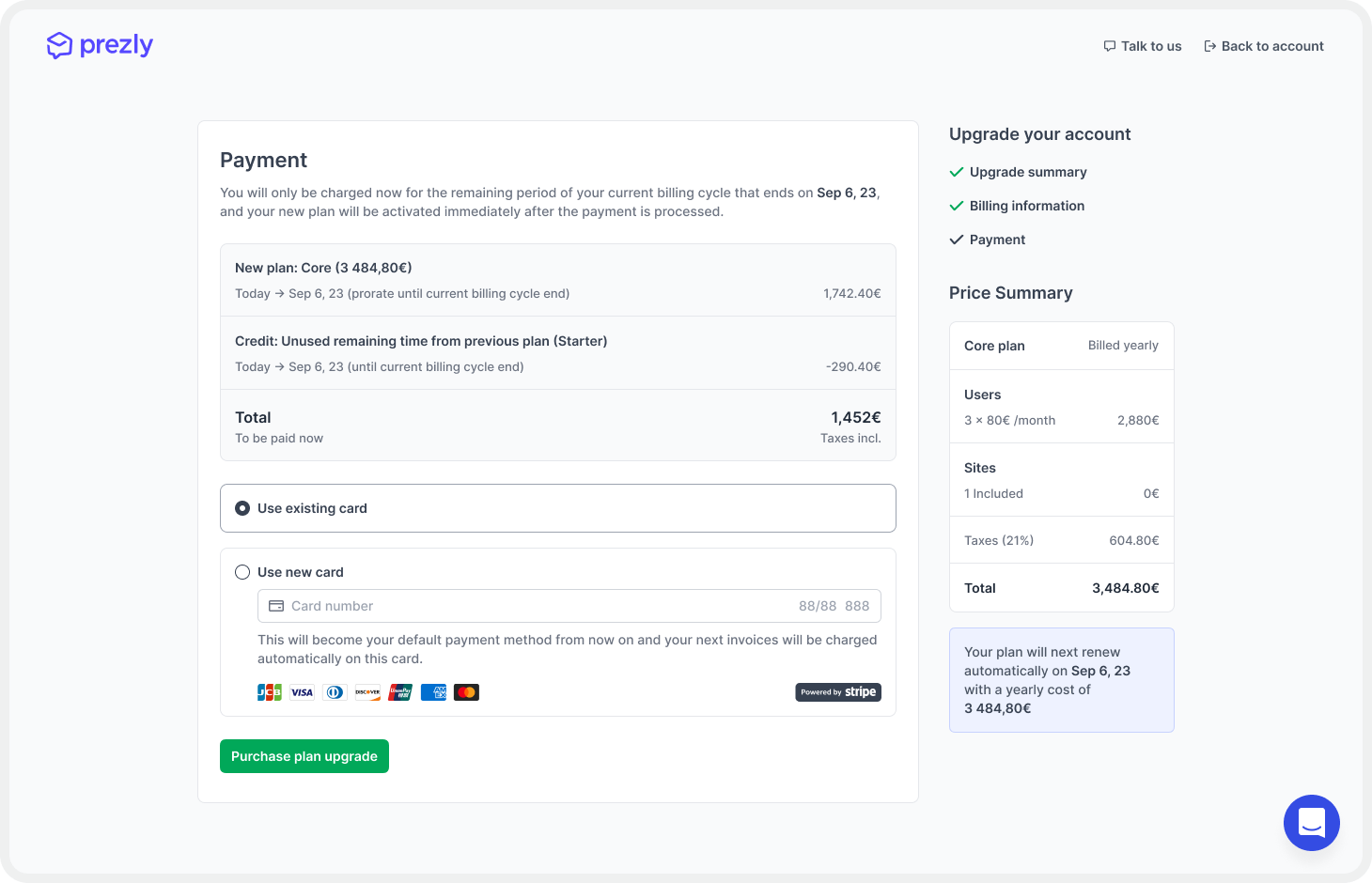
On the payment step, we made changes to explain the amount users will be charged upon upgrading. The pro-rated amount will be the price for the new plan during the remaining billing cycle time, minus the price we have already charged them for their remaining time on the cycle. We made sure to provide all the necessary information to make it clear, without overwhelming users.

Finally, we included an extra feature that allows users to pay using their existing credit card on file, making the process seamless and without any unnecessary drop-offs.

In conclusion, we've made significant improvements to the billing and subscription management experience for Prezly users. Our new Billing page, connected to the Plans page, makes it easier for users to access all billing and plan details from one place, enabling them to understand their subscriptions better. With the new self-upgrade flow, users can upgrade their subscriptions seamlessly and without needing to contact support.
Our goal was to create a more user-friendly and transparent billing and upgrade process, and we have achieved that with these enhancements. By simplifying the process and providing more detailed information, we have enabled users to manage their subscriptions with ease and confidence.
Measuring success
To measure the success of this project, we've set some milestones we want to achieve. Now that everything is implemented and public, we will make sure to follow progress on:
- Reducing the number of products/prices and better distribution of customers on those plans.
- Increasing the number of upgrades (consolidation to list plans) from existing customers.
- Reducing and ideally removing deprecated/legacy plans.
- Reducing the number of work/conversations about our current pricing tiers.
What have I learned from this project?
This project was challenging, but it provided an excellent opportunity to learn and grow. One of the essential takeaways was the need to have a complete understanding of the problem we were solving. In this case, we needed to study Prezly's pricing models, support processes for upgrades, and billing/invoicing procedures. This knowledge was crucial to the success of the project.
Another critical lesson was the importance of constant communication with stakeholders. As this project involved several business decisions, it was vital to keep stakeholders informed and involved throughout the design process. Their feedback and input helped us refine the solution and create a more effective product.
I also learned that as product designers, we must remain flexible. While we bring our expertise and ideas to the table, we must also listen to others' opinions and ideas. Sometimes, their ideas may be as valid as ours, and we need to find the right balance between pushing our view and conceding to someone else's perspective. Ultimately, the success of the project and the company we work for is the top priority, so we must be willing to adapt and be flexible in our approach.
In conclusion, this project taught me the importance of understanding the problem fully, constant communication with stakeholders, and remaining flexible in our approach. These lessons will definitely help on my journey of becoming a better product designer, and I'm excited to apply them to future projects.
See you in the next project! 👋
Hugo Felix
Product Designer @Prezly | → hugo@prezly.com
.png)
.png)
.png)
.png)
