How we revamped a 7 years old feature: Prezly's Media Galleries
9 min read - We decided to rebuild the newsroom media page to bring it up to date with our current design and code standards. This is the story of how we did it.

The newsroom media page is an integral part of Prezly, allowing users to easily upload, organize, and display their brand assets such as logos and product shots on their media galleries page.
It has been a reliable feature for the past seven years, but as we've been working to modernize Prezly and bring all pages up to date with our current standards and components, we realized that it was time to give the media page a revamp.
This is the story of how we did it...
Why working on this?
The newsroom media page had been using legacy code and outdated components for far too long, causing it to become slow and cumbersome to use. It struggled with handling large numbers of galleries (10+), making it difficult to make even minor improvements to the page or user experience.
We found ourselves stuck in a cycle of avoiding any work on the page due to the challenges posed by the outdated codebase. As a result, we knew it was time to give the media page a much-needed update to bring it up to date with our current design and code standards.
How big of a change can we make?
To improve the page, we add the initial idea of integrating the "add gallery component" from our story editor (where users create their "posts"). This would allow us to reuse elements of our story editor (assuming users are more familiar with it) on the media galleries page.
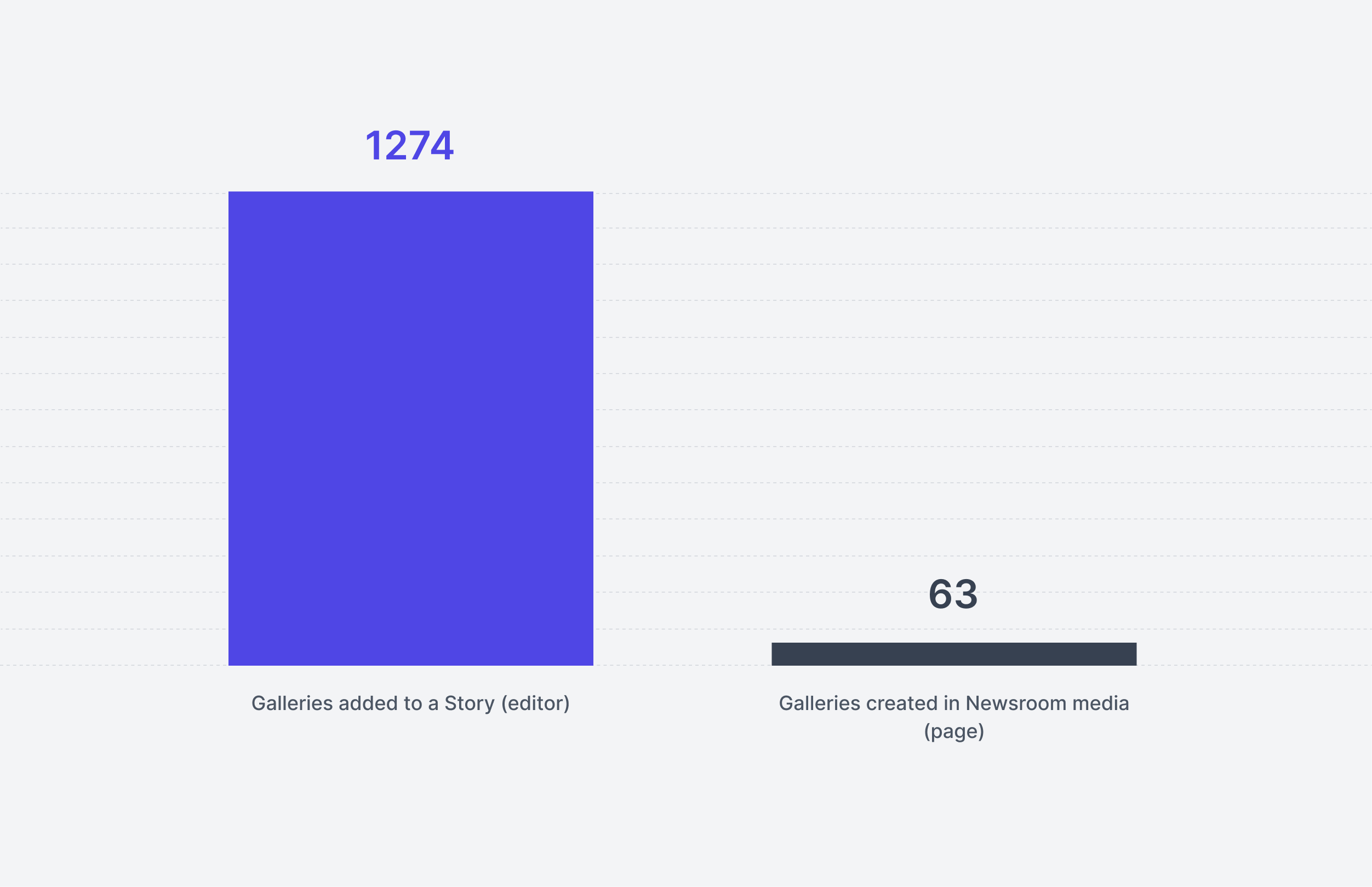
To better understand if our assumption was correct, we gathered some data that told us that 1,274 users added a gallery using the story editor component (flow), while only 63 users had added it using the media galleries page flow.
.png)
This means that the story editor's flow is significantly more popular than the media galleries one and that we would be safe to proceed with our initial idea.
We also wanted to understand the overall usage of the media galleries page in order to understand how many people the change would be affecting (would also tell us how safe it would be to make the change). The data shows that half of all public galleries (7.2k) and content (155k images) belong to just two licenses, while an additional ~20 licenses have more than 1,000 public images, telling us that we would be quite safe on making a big change to this page (since there are not a lot of users currently using it).
How we made it work?
Based on our assumptions and supporting data, we had a clear roadmap for updating the media page. We decided to use the editor's gallery component to allow users to add their galleries to the media galleries page, and our focus became determining how to display all the galleries on the page.
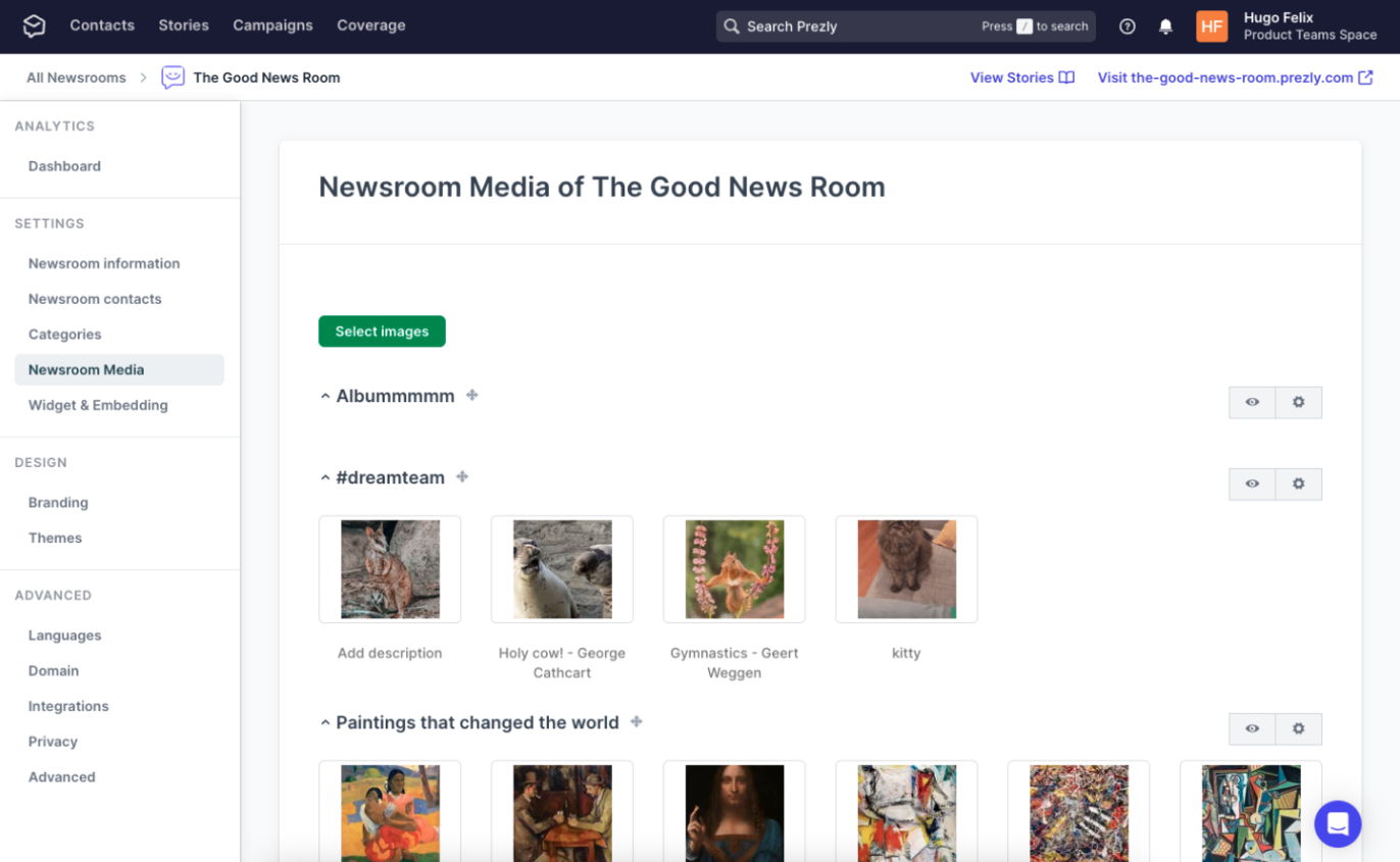
Previously, we had used a type of grid that was specifically designed for this page and was no longer used elsewhere. We wanted to modernize this page and use one of our "new" grid components, which is our preferred way of displaying Prezly content to users.
The new media galleries page
The first major change we made was to the page name. Despite internally referring to it as the media galleries, the page title was displayed as "Newsroom media of [newsroom-name]", which was not ideal and had a strong bias towards PR (we have recently been expanding beyond PR and making Prezly more accessible to non-PR users).
Therefore, we decided to simply call it the "Media galleries", which accurately reflects its purpose as a collection of media files, typically images or videos, that are displayed and organized together.
As mentioned previously, we also took one of our grid components (the site's page grid) and made some small tweaks to include the necessary features for this page.
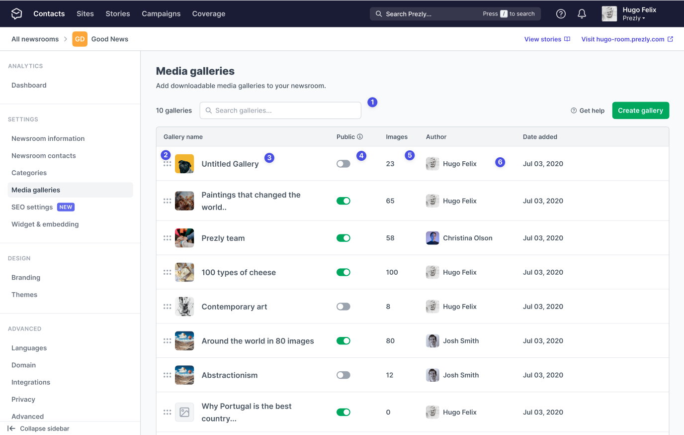
- A search input that allows users to quickly locate a specific gallery. This feature will only be available to licenses with 8 or more galleries.
- The ability to reorder the placement of galleries, which would be reflected on their sites (galleries at the top of the page would be displayed first).
- The display of the gallery name and main image makes it easier for users to distinguish between their content. By clicking on the name or image, users can open the gallery allowing users to edit its details.
- The ability to edit the visibility of a gallery (public or private).
- The display of the number of images inside a gallery, helps users to better organize their galleries by importance.
- The display of the gallery author and creation date provides context for the gallery creator or whether the images are still relevant.
These changes aimed to make the media gallery more user-friendly and efficient for managing and organizing media assets.
Creating & editing galleries
As we planned the gallery creation and editing flow, we were certain of two things. First, we wanted to use the story editor's gallery component. Second, we wanted the gallery to look the same during the editing/creation phase as it would when published on the site. This would help users to understand how their galleries would appear to viewers and make it easier to make any necessary adjustments.
The big issue here was defining the page layout. Should we make it on as an aside or have a standalone page for it?
Both of the solutions had pros and cons, but having it on an aside kind of stood out as a better solution mainly due to the fact that it made it easier for users to navigate between galleries by allowing them to click and open a gallery in the opened aside, rather than having to open a new page.
From a development standpoint, using a side panel for gallery creation and editing was also more efficient because it "already exists in the pitch and snippets features," allowing us to reuse those components.
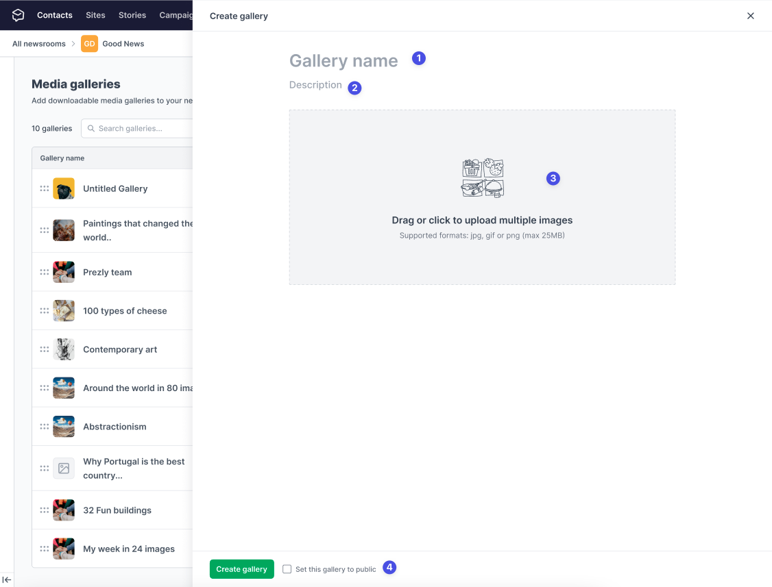
- Users can define the gallery title during creation.
- The addition of a gallery description field, allows users to provide more context about the gallery. This was a frequently requested feature that was not part of the old flow.
- The images will be added using the known editor component
- Additionally, users will also be able to set the gallery visibility directly from the aside.
To ensure a clear view of how the gallery will appear on the site, we set the width of the side panel bigger than the width of the site's gallery. This will allow users to see the gallery as it will appear in the most common screen resolutions.
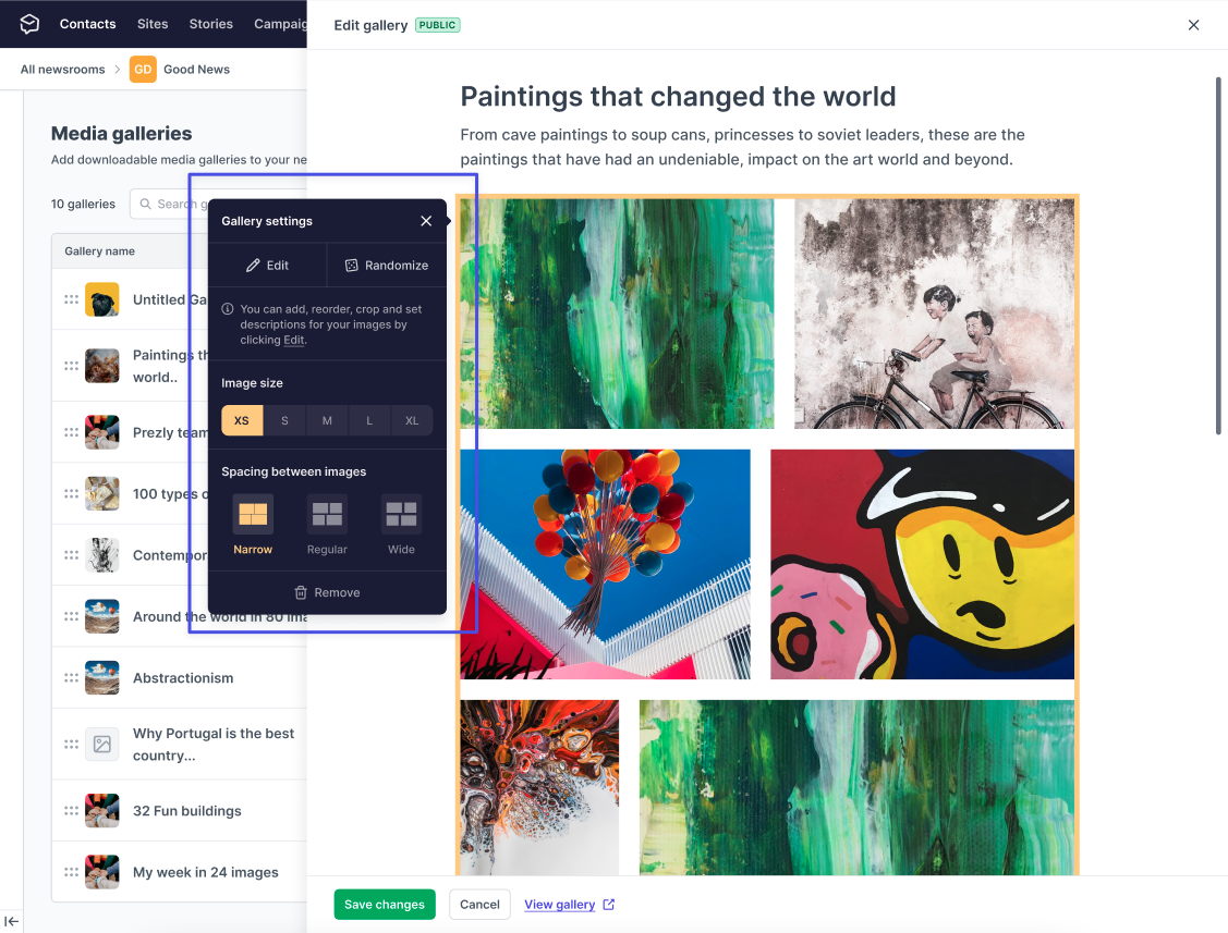
To edit a gallery, users will use the same side panel as the creation flow. However, when they click on the image module, a settings panel will appear (similar to the one in the story editor) that allows them to edit their images, adjust the width and size of the gallery, and control the spacing between images. This provides users with a familiar interface and a range of options for customizing their galleries.
Promoting the feature
Attracting new users to a feature can be challenging, but changing things for those who are already using it can be just as difficult. That's why we needed to be careful in how we promoted the updated media galleries page. We wanted to ensure that existing users were aware of the changes and understood the benefits, while also making the page more appealing to potential new users.
To ensure a smooth transition for existing users of the media galleries page, we reached out to them almost personally via email and provided detailed changelogs and help articles. This helped users to understand the changes and navigate the updated page from the outset.
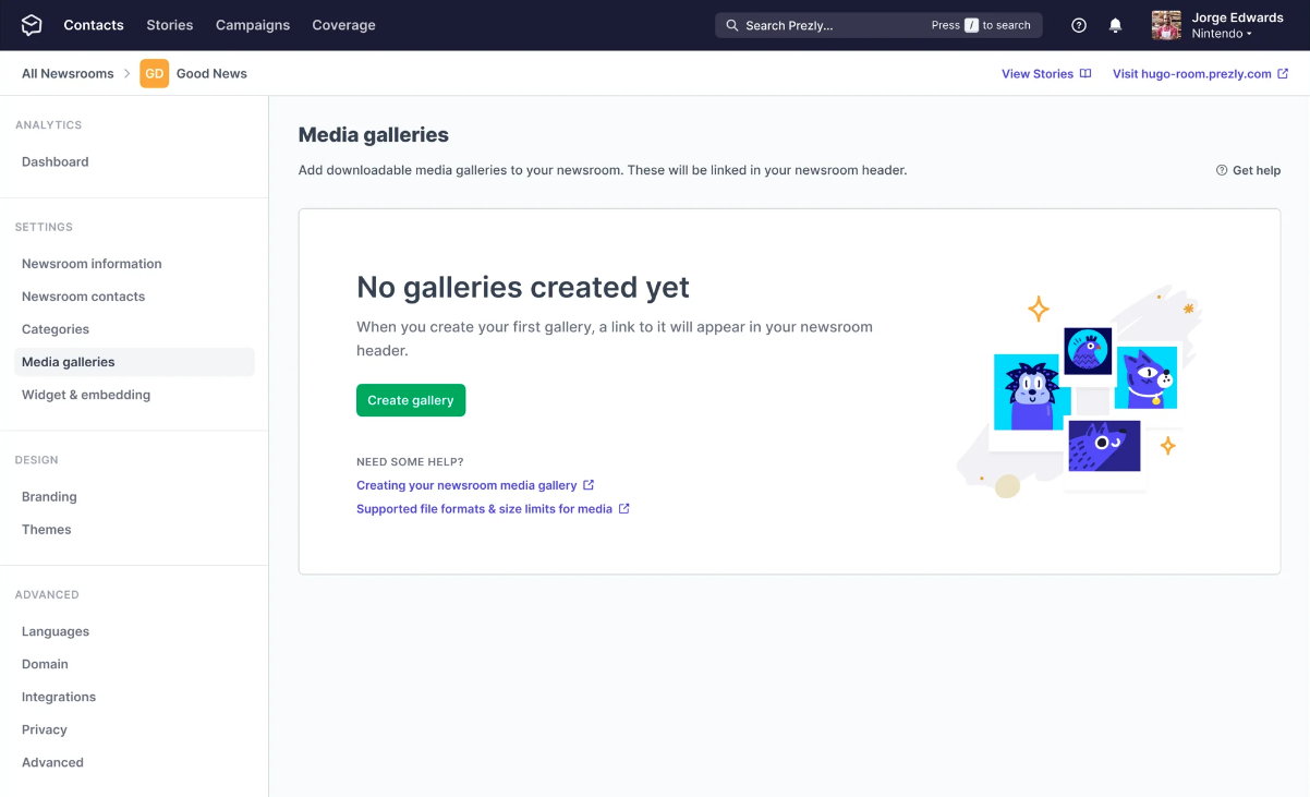
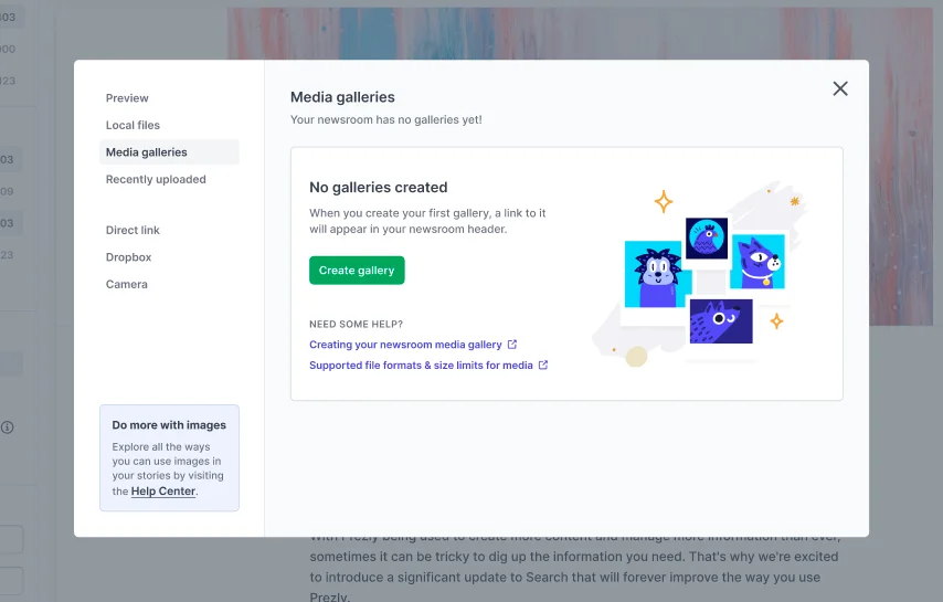
For new users, we sent out a "new feature" email campaign and added improved hints throughout the app to draw attention to the "new" media galleries page. We've created a new empty state for the page (displayed when users don't have any galleries added) and revamped the media galleries section of our image uploader to provide more information when there are no galleries.
What have I learned from this project?
- Simple projects can become complex in a blink of an eye
- Despite having a clear shaping document (briefing), we ran into some trouble with decision-making that cost us a couple of days and made the project more convoluted than expected.
- All parts of the briefing should be considered
- If any points are left out in the briefing, it's important to clarify and explain them. In this case, we overlooked a point in the briefing, which resulted in the need for an additional two days to complete the project (which is kind of a mortal sin when you use the shape-up framework).
- Acknowledge what went wrong, but also what went good
- While this project had its challenges and did not go as smoothly as we would have liked, it's important to remember the positive aspects and how they will benefit users. Despite being frustrated with the extended timeline and missing the delivery date, we should've also looked for the things that went good (and there were a lot of them)
See you in the next project! 👋
Hugo Felix
Product Designer @Prezly | → hugo@prezly.com
